Showing posts with label design. Show all posts

07 January 2009

2009

Wallpaper's annual Graduate Directory is out. As usual, the directory is overwhelmingly populated with British and continental designers/artists. a few Asia's rising starts have been nominated of course. i don't know if it's a question of information access, but then design is a visual discipline, action, and product at its core and should transcend barriers. And of course, young alums from the Bartlett win a spot :)

Looking at the Architecture list, i am pleasantly surprised to see a wide range of orientations other than deconstructivist madness. Of course i'd love to see more divas a la Zaha Hadid running around, but something simple and refreshing is sometimes underrated.


Kudos to the webpage designer for making things so clean, classic, and simple yet very playful and easy to navigate. because last year's diagrammatic lay-out for this huge bundle of information was a design faux pas.


25 September 2008

Underground


I came across this drawing on ffffound.com a while ago and starred it as favorite. The lines are very confident and photorealistic. I like it a lot. And two days ago as I sit in the tube on my way to university, one lady steps into the car, holding an eco bag by Marks & Spencer that has this very image on it. Exceedingly beautiful. i'm so getting one.

14 August 2008

contemporary architecture and its material

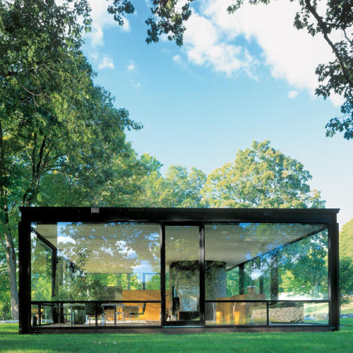
A Daily Dose of Architecture today published a story about how the manipulation of glass is reinterpreted in contemporary architecture. A century ago, glass was widely embraced in modern architecture as an innovative material that ended the separation of the inside from the outside in the form of "curtain walls" - a planar, two-dimensional slate of glass that we're familiar with. Some of my personal favourite examples include:

The Philip Johnson Glass House, CT


Crown Hall, Illinois Institute of Technology


"Today, says ADDoA, glass is seen less simply. Instead its presence is explored via a number of procedures, from casting and bending to silkscreening and other surface enhancements. One aspect of this is the transformation of curtain walls from two-dimensional surfaces to three-dimensional, vertical terrains." The examples representative of this breakthrough are:

Trutec Building in Seoul, Korea


The Spertus Institute of Jewish Studies in Chicago


The last example is conveniently located in the heart of Chicago, across from the famous Millennium Park and the Art Institute. so yeah, pretty high-traffic. Since it lies on one of the main streets, I had to pass by the buildings several times when I was in Chicago earlier this year. And yes, the real thing is pretty stunning especially when "read" in comparison to the adjacent buildings, making the otherwise strictly flat facade of the entire block now look subversively irregular.

Andrew Ballantyne, the author of A Very Short Introduction to Architecture remarks that the architecture of today's museums are highly politicised and that the temporality and indeed exterior material display of architecture does not necessarily have to match that of the content inside. Most of American art museums are housed in Neoclassical architecture (in order to borrow the highness of classical architecture to make a certain legitmacy claim, of course) although they of course do not show simply Greco-Roman artefacts. Similarly, the fancy outrageous architecture of the Guggenhiem Museum in Bilbao, Spain by far surpasses the modest calibre of the artworks, the raison d'etre of the museum inside. Here too, the Spertus Institute as an educational institute for Jewish studies enjoys the "modern" facade that more commonly comes to be associated with furniture showrooms, design studios, high-end boutiques, financial headquarters or technologically innovative sciences like architectural design, engineering, and the like. Of course, I'm not saying contemporary architecture strictly belongs to the glossy showroom types (seeing as I agree on the occasional lack of connection between architecture and its content), but what makes the Spertus all the more noteworthy is that the building at the corner, the famous cutting-edged Columbia College and its affiliate Museum of Contemporary Photography which is housed in a relatively normal-looking building. This is fun to think about.

Like sculptors, some architects are good at manipulating tradtional materials they have at hand. They can follow the intrinsic physical quality of such material. Or they can revert the convention and make something that surpasses the commonly perceived quality. This reminds me of a lecture on neolithic jade art in my Chinese art class I took last fall. Prof. Bickford showed us two contrasting examples, the first of which was the jade cabbage where the artist worked on the given combination of white and green texture and accordingly made a cabbage of out it. The second contrasting example (which I unfortunately cannot find a picture of) was a painstakingly woven bracelet made of sculpted jade. The artist basically gave a flowing, malleable look to his work, so the work looks more like green threads woven together with the same sensiblity as a cloth bracelet. Clearly, these architects and jade craftsmen are so highly sharp-eyed that they somehow saw plasticity in rock-hard materials us normal people don't. Artistic flair is timeless man :)


24 June 2008

The Collaboration

It's certainly not the first time that we have seen collaboration between art and fashion - topping the list that i can think off the top of my head is Andy Warhol who was one of the first contemporary artists to pioneer and blur the gap between art and life, the product of which process is the infamous Eau d'Andy and the other ensuing commercial(ized) items. Next we have Takeshi Murakami who unleashed the Multicolore Louis Vuitton (which would be dismissed as garish if it weren't for the logo LV). This is even more interesting that the Museum of Contemporary Art in Los Angeles was used as the venue to showcase the products line. I know that Murakami is a world-renowed artist and all, but the fact that the institutional and physical context of the museum as a place traditionally reserved for "artworks" now carries luxury items as undemocratic as LV at all makes such collabaration, its appropriateness aside, all the more outstanding.


Or, the unique case of Ed Ruscha, who i admire greatly, who shot and even posed as an icon for the "desirable" contemporary refined culture for Lord & Taylor's facelift. And recently the starchitect Zaha Hadid was commissioned to design the Chanel exhibit, the "Mobile Art" in Hong Kong. Of course, i know what this is all about - it is the exceptional artistic quality these people possess that lends the product greater legitimacy and status, transcending the conventional high-street luxury to the iconic artwork that now feels tangible and functional.
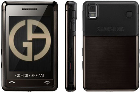
The reason I brought this up is that I was at a mall yesterday with my friends walking around from shop to shop. One of them wanted to get a new phone and resented me for not getting her an iphone from the states. When we were looking around in a phone shop, i suddenly spot this ultraglorious sleek Samsung phone designed by, well, Giorgio Armani which effortlessly stood out among the crowd in its amber glory. If i remember correctly the Prada LG phone was released not long ago, and the design is in fact pretty similar. what's with these two korean giant chaebols and their Asian markets? Anyways, this it phone is priced at 23,000 THB which is approx. 689 USD. To make the whole brand loyalty landscape even fiercer, this is a limited edition and only 3,000 such phones are available for sale in Thailand. yes, wth?! Since it was debuted in February this year, i'm sure not many are currently left in store to go around. It doesn't take the lady who holds the Multicolore Murakami LV in her nicely manicured hand to answer you why she's willing to spend thousands of dollars on a bag whose function/utility is not different from the next Macy's handbag. My pulsating itch to own that Armani Samsung it phone without even first learning its specifications says it all. It's all about the icon. It makes my mouth water.


I wonder how nice it would feel in my hand.

11 June 2008

On vodka

In Sex and the City, after finding out that her boyfriend will not show up at their own wedding (held at the New York public library), a devastated Carrie Bradshaw returns to her apartment with her girlfriends who later hang around to console and keep her company. In a span of 5 seconds, I remember spotting one of the girls pour Skyy vodka and hand it to Bradshaw. It didn't dawn on me until much later - tonight in fact, on my bus ride home - that i have never in my life had Skyy vodka.

To be sure, the bottle design is winner. Very retro and simple, the minimalist sky-blue bottle exudes confident elegance, which should not be surprising since it's a relatively recent creation (in the 90's). But what's much more surprising, to me at least, is it's an American vodka. California to be precise. Not that i doubt the American taste or capacity or anything (ok, i do), but i have the impression that most of the hard liqueurs we consume are all imports. And Americans are better known for their beers. Anyways, maybe i should give it a try next chance i get...which is not happening anytime soon, since heavy taxes are imposed upon luxury items like automobiles, beauty products, perfumes, and of course booze and i don't wanna pay extra for something i could get for cheaper elsewhere (but where?). In passing, their website is also very nice. High resolution not required but earnestly recommended. 

Speaking of bottle design, this reminds me of one Swedish vodka whose bottle design is also very cool and patriotic - Svedka. Bold blue prints and a tiny Swedish flag. Again, I have yet to find out what it tastes like although I came this close to having a swig. I got a bottle from a liqueur store and left it at sunny's apartment... and last time i checked, it was nowhere to be found. um, hello? anyways, design-wise I still prefer Skyy because 1) its distinct signature blue is pretty stunning and 2) the Svedka bottle in many ways still yells Absolut. That said, I should not discourage myself from tasting them the next chance I get. I know you can't go wrong with Absolut or Smirnoff, but when it comes to sensory perception, some things are worth exploring. 

What about Greygoose? Meh…don’t know lah because I don’t take shots (weak I know). Supposed to be one of the best, I hear? I don’t know what the best vodka tastes like, but I’m sure as hell I’ve tasted one of the worst. Ohmygod I don’t even want to bother to recall the name. maybe I’ll google “cheap vodka” later or something. The taste is as bad as its garish design (plastic bottles, white plastic cap, gold engravings on some red label, 10 bucks, do the math). We mixed this shit in the drinks we sold at Machado parties. Hahaha owned! ( I think they serve Greygoose at Buxton. surprise?) I think it just tastes like bitter water, period. Other than that, come to think of it vodka is probably my ultimate favourite hard liqueur. I mean rum & coke is alright. Gin & tonic is refreshing and all. But nothing beats good ol’ screwdriver. I heard somewhere (food network?) that you should put a little club soda in it to add to the fuzz. Now I think I’m a little thirsty hmmmm…

03 June 2008

This is

Amazing.

"A creative way to cover a building for renovation"


source: ffffound.com

07 April 2008

Au Bon Portions


Food, Fashion & Lifestyle


I've been meaning to write an entry on the latest invention of one of my favourite eateries Au Bon Pain for quite some time. And tonight seems like a good opportunity since I don't want to start reading Walking since Daybreak and later write a "serious book review", as my European History professor puts it, quite yet. So what else, if not this form of procrastination which obviously starts to get to me, can make you feel fulfilled, self-righteous, and less guilty at the same time?

"Au Bon Portions" is ABP's latest culinary line that features some fifteen selections packaged individually in a tiny transparent plastic box. "Lunch box is cool again" is the tag-line that conceptualizes the campaign. As with its other preceding promotion lines after its recent face-lift, the "coolness" of the Portions boxes oozes from the great variety of selections ranging from a set of cheddar, grapes, and crackers which mimics a fancy cheese&crackers plate, to Hummus & cucumber. These individually packed boxes clearly respond to the demand of people who enjoy the on-the-go lifestyle and want to have the freedom to mix-and-match food items that a conventional-sized lunch would not allow. Whether what you look for is a side-dish for your salad/sandwich or some late-afternoon bites, the Portions are certainly the way to go.

I was swept away the minute I saw the shelves of Thayer St. ABP fully stocked with these tiny boxed small plates which literally gleam like a chic luxury item, an edible precious stone. I can't help but nod at ABP's unyielding creativity to marry luxury with affordability, and thus make all their bistro-style offerings pleasingly customizable. To delve in further I in fact think that the tomato wedges, crackers, asparagus, etc seem to be casually thrown in yet look effortlessly artistic in all their miniatured beauty. Yet another addition to the food fashion industry. On a closing note, below are the picture of Thayer St. ABP I took a while back. Cheers.


19 March 2008

Ack!

Ah.

I decided to change the template. As if it isn't already very obvious to you, I need to be more active (in blogging in general and in designing in particular) and attentive to the design detail considering that I will become a designer of some sorts in the future (hah!) and paying meticulous attention to his/her immediate milieu should come naturally to every designer. Yes, I kid myself a lot.

Nooo... I kid you not. Just like painters who ponder what color expresses what corresponding emotion, some clothes designer and contemporary architects in fact do a lot of research on material, pattern, and method, trying to formulate a perfect recipe that best articulates their ideas. Okay this might sound ridiculous to some, but to sound like the fattest snob ever, I think these people's brains must be all used up, worn down, and wrinkled because they never stop thinking about shit. (However, as one of my friends once put it, outside of the art world who in this world takes art seriously anyway? Whatever...)

Take as an example the Scottish Parliament in Edinburgh, Scotland, which I had the honor to pay a visit to this past winter break. Designed by Eric Miralles, the architecture of this new parliament building has won numerous awards for its creativity, originality, and its genuine and successful attempt at representing and articulating Scottishness through the design and material.


Aerial View at night


Aerial View from the Top
(on the right across from the Parliament is a Scottish palace, which you can't see in this picture)


A l'interieur


So what did I mean when I was talking about the exterior design and the articulation of the underlying idea? Basically, the building incorporates and reflects the ideas of earth, land, and the Scottish indigenity. When I read the Statement, I was suddenly reminded of a Sanskrit word Bhumi, which to me doesn't mean just land in its bare physical sense but transcends to the national ties the people have to their homeland. Personally, I'm not too sure if I feel anything at all (admiration, disapproval, etc) towards the building, but I sincerely respect the architect's choice and more importantly I appreciate the fact that the steel-and-glass dogma of contemporary architecture is employed to speak for something deeper than the clichéd "simplicity."

I visited the Scottish Parliament as part of my visit to Scotland (which is in turn part of my trip to the UK). The Parliament in fact also function as a museum displaying, well, itself to the visitors. There is an exhibition on the history of the project on the first floor with tons of brochures with many different languages.I took some of the most beautiful pictures in Scotland, only to lose them all later due to some technical difficulty on my friend's laptop (hah!). But despite all this, a good time was had. I love Glasgow and Edinburgh and would certainly love to go back if a second chance comes around.

On an unrelated note, to pick up on my last post on my pathetic insomniac self that I left off at last time. Dear good god, this occasional friend of mine Insomnia for some reason has changed his mind to prolong his stay. With me. But his pattern is different this time around, mind you. Instead of keeping me perfectly awake from 3AM to 10AM, he now plays a game of deception. tsk.tsk.tsk. He lets me sleep - or at least me think I am sleepy - at around 3AM and three hours later smacks me right in my head. Results? Me fully awake again at around 6AM like no man's business. Ridiculous.

Ok, I vow to pimp my blog once inspiration comes around. Man this is just so bad to live simply on other people's inspiration.